The hospital experience that helped our design for ICUs get better
Our Intensive Care Unit infographic has struck a chord in a way we’ve never experienced before. Over one million twitter views, 20,000 re-tweets and enquiries from around the world; France, USA, Turkey, Denmark to Australia, and across the UK. Design for healthcare has always been a part of our business, from dentistry to mental health, cancer support and awareness campaigns and we’ve had great feedback – but the reaction to the ICU design has been astonishing. What was different this time?
Looking back, it’s clear that it was a particular personal experience that helped make this design one that others can totally relate to.
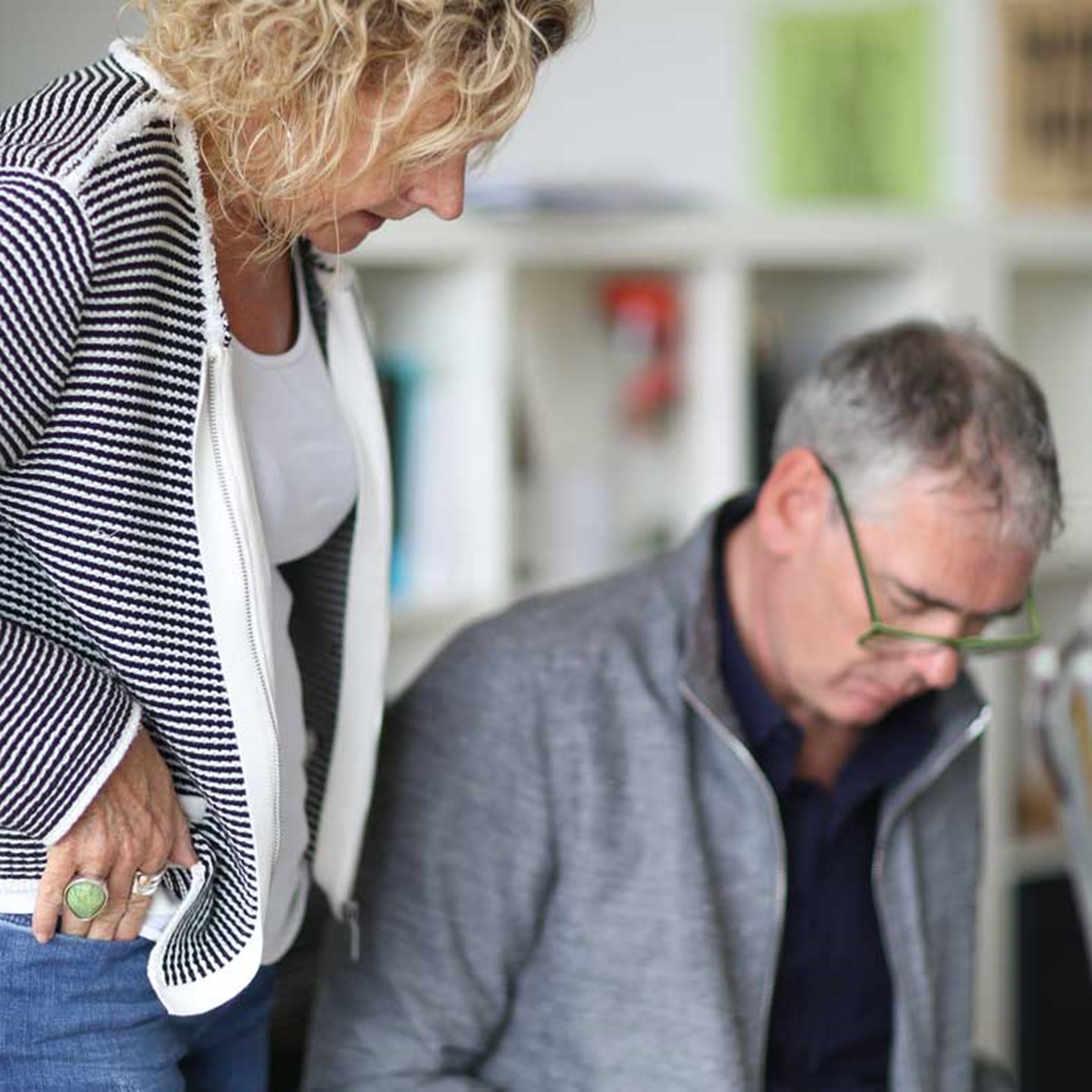
In Spring 2018, a design commission for a Bristol hospital coincided with a cancer diagnosis for Gill. Early identification meant the prognosis was good, and the hope was that a single operation would be all the treatment needed. With hindsight it seems obvious that designing for hospital whilst being patient and visitor (in a different hospital) would change our perspective.
Every aspect of the NHS care Gill received was amazing - but a hospital visit is an anxious time - the environment unfamiliar. We felt disorientated. Post-operation Gill was in a medical ward attached to machines - machines that bleeped. And the numbers on the machines - what did they mean? - what was good, bad, normal? There was no explanation of the equipment around the bed which added to the stress and anxiety.
Thankfully Gill’s treatment was successful and she was given the all clear. But the experience really affected us, and when we walked around the ICU as part of our client meeting we recognised the feelings of stress and disorientation from being in unfamiliar medical environment.
Critical care has more equipment and technology than most wards and we recognised that giving patients and visitors better understanding of this environment could be calming and reassuring.
The ICU equipment diagram was produced as part of a wider brief – that included a need for artwork to make the empty corridors more welcoming and for designs to improve wayfinding and visitor information: signage, leaflets and wall art that would improve the patient journey – informing, orientating and engaging.
Our approach is influenced by Beck’s London Underground Tube map – an iconic design that simplifies a complex system of routes, providing accessible information for travellers in a crowded, often stressful environment – it is functional, informative and beautiful – just what we needed to achieve for the ICU artwork.
We created a simplified and streamlined plan of ICU patient equipment – colourful illustrated icons of each machine, along with written descriptions free from jargon and technical language. We felt if patients and visitors could take their time in absorbing information about the department it would reduce anxiety and questions to staff.
The final design combines visual appeal with functionality, beauty and utility. The work was installed in the ICU corridor (over 2 meters high and four metres wide) and has become a point of reference in a space where it’s easy to get disorientated. Word spread among the Critical Care community on Twitter and we have now worked with another 12 hospitals to produce bespoke versions of these diagrams and other designs – all with the same goal of improving patient experience.
The feedback has been overwhelming and bought us both a great sense of achievement. We are helping people at a very challenging time as well as the staff supporting them.
And it’s not just our clients that have applauded our design work, it’s been recognised in academic publications too, and by the Intensive Care Society. There is no doubt that our experience profoundly affected how we approached this work – a difficult time has inspired an effective design.
Testimonials
These graphics have been a brilliant addition to our unit, they have helped patients and visitors to understand some of the equipment that they may encounter on the ward and the purpose of this. We also have a graphic showing the history of our service and ventilation which has been commented on by so many visitors to the unit.
The infographics that Marles and Barclay have designed have totally transformed what was a blank and uninspiring space into an area showing visitors, patients and staff the vital work that the ward performs and sharing information about the ward and the equipment they may see. Thank you Marles and Barclay we are thrilled with the designs and with how you worked with us to make these perfect!
Verity Ford
Advanced Practice Physiotherapist in Ventilation
Aintree University Hospital

